uni-app的基本使用

课程介绍:

基础部分:

  • 环境搭建
  • 页面外观配置
  • 数据绑定
  • uni-app的生命周期
  • 组件的使用
  • uni-app中样式学习
  • 在uni-app中使用字体图标和开启scss
  • 条件注释跨端兼容
  • uni中的事件
  • 导航跳转
  • 组件创建和通讯,及组件的生命周期
  • uni-app中使用uni-ui库

项目:黑马商城项目

uni-app介绍 官方网页

uni-app 是一个使用 Vue.js 开发所有前端应用的框架,开发者编写一套代码,可发布到iOS、Android、H5、以及各种小程序(微信/支付宝/百度/头条/QQ/钉钉)等多个平台。

即使不跨端,uni-app同时也是更好的小程序开发框架。

具有vue和微信小程序的开发经验,可快速上手uni-app

为什么要去学习uni-app?

相对开发者来说,减少了学习成本,因为只学会uni-app之后,即可开发出iOS、Android、H5、以及各种小程序的应用,不需要再去学习开发其他应用的框架,相对公司而言,也大大减少了开发成本。

环境搭建

安装编辑器HbuilderX 下载地址

HBuilderX是通用的前端开发工具,但为uni-app做了特别强化。

下载App开发版,可开箱即用

安装微信开发者工具 下载地址

利用HbuilderX初始化项目
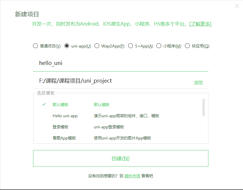
  • 点击HbuilderX菜单栏文件>项目>新建

  • 选择uni-app,填写项目名称,项目创建的目录

运行项目

在菜单栏中点击运行,运行到浏览器,选择浏览器即可运行

在微信开发者工具里运行:进入hello-uniapp项目,点击工具栏的运行 -> 运行到小程序模拟器 -> 微信开发者工具,即可在微信开发者工具里面体验uni-app

在微信开发者工具里运行:进入hello-uniapp项目,点击工具栏的运行 -> 运行到手机或模拟器 -> 选择调式的手机

注意:

  • 如果是第一次使用,需要先配置小程序ide的相关路径,才能运行成功
  • 微信开发者工具在设置中安全设置,服务端口开启
介绍项目目录和文件作用

pages.json 文件用来对 uni-app 进行全局配置,决定页面文件的路径、窗口样式、原生的导航栏、底部的原生tabbar 等

manifest.json 文件是应用的配置文件,用于指定应用的名称、图标、权限等。

App.vue是我们的跟组件,所有页面都是在App.vue下进行切换的,是页面入口文件,可以调用应用的生命周期函数。

main.js是我们的项目入口文件,主要作用是初始化vue实例并使用需要的插件。

uni.scss文件的用途是为了方便整体控制应用的风格。比如按钮颜色、边框风格,uni.scss文件里预置了一批scss变量预置。

就是打包目录,在这里有各个平台的打包文件
1
2
3
4
5
6
7
8
9
10
11
12
13
14
15
16
17
18
19
20
21
22
23
24
25
26
27
28
29
30
31
32
33
34
35
36
37
38
39
40
41
42
43
44
45
46
47

```pages``` 所有的页面存放目录

```static``` 静态资源目录,例如图片等

```components``` 组件存放目录

为了实现多端兼容,综合考虑编译速度、运行性能等因素,`uni-app` 约定了如下开发规范:

- 页面文件遵循 [Vue 单文件组件 (SFC) 规范](https://vue-loader.vuejs.org/zh/spec.html)
- 组件标签靠近小程序规范,详见[uni-app 组件规范](https://uniapp.dcloud.io/component/README)
- 接口能力(JS API)靠近微信小程序规范,但需将前缀 `wx` 替换为 `uni`,详见[uni-app接口规范](https://uniapp.dcloud.io/api/README)
- 数据绑定及事件处理同 `Vue.js` 规范,同时补充了App及页面的生命周期
- 为兼容多端运行,建议使用flex布局进行开发

#### 全局配置和页面配置

##### 通过globalStyle进行全局配置

用于设置应用的状态栏、导航条、标题、窗口背景色等。[详细文档](https://uniapp.dcloud.io/collocation/pages?id=globalstyle)

| 属性 | 类型 | 默认值 | 描述 |
| ---------------------------- | -------- | ------- | ------------------------------------------------------------ |
| navigationBarBackgroundColor | HexColor | #F7F7F7 | 导航栏背景颜色(同状态栏背景色) |
| navigationBarTextStyle | String | white | 导航栏标题颜色及状态栏前景颜色,仅支持 black/white |
| navigationBarTitleText | String | | 导航栏标题文字内容 |
| backgroundColor | HexColor | #ffffff | 窗口的背景色 |
| backgroundTextStyle | String | dark | 下拉 loading 的样式,仅支持 dark / light |
| enablePullDownRefresh | Boolean | false | 是否开启下拉刷新,详见[页面生命周期](https://uniapp.dcloud.io/use?id=%e9%a1%b5%e9%9d%a2%e7%94%9f%e5%91%bd%e5%91%a8%e6%9c%9f)。 |
| onReachBottomDistance | Number | 50 | 页面上拉触底事件触发时距页面底部距离,单位只支持px,详见[页面生命周期](https://uniapp.dcloud.io/use?id=%e9%a1%b5%e9%9d%a2%e7%94%9f%e5%91%bd%e5%91%a8%e6%9c%9f) |

##### 创建新的message页面

右键pages新建message目录,在message目录下右键新建.vue文件,并选择基本模板

```html
<template>
<view>
这是信息页面
</view>
</template>

<script>
</script>

<style>
</style>
通过pages来配置页面
属性 类型 默认值 描述
path String 配置页面路径
style Object 配置页面窗口表现,配置项参考 pageStyle

pages数组数组中第一项表示应用启动页

1
2
3
4
5
6
7
8
9
10
11
"pages": [ 、
{
"path":"pages/message/message"
},
{
"path": "pages/index/index",
"style": {
"navigationBarTitleText": "uni-app"
}
}
]

通过style修改页面的标题和导航栏背景色,并且设置h5下拉刷新的特有样式

1
2
3
4
5
6
7
8
9
10
11
12
13
14
15
16
"pages": [ //pages数组中第一项表示应用启动页,参考:https://uniapp.dcloud.io/collocation/pages
{
"path":"pages/message/message",
"style": {
"navigationBarBackgroundColor": "#007AFF",
"navigationBarTextStyle": "white",
"enablePullDownRefresh": true,
"disableScroll": true,
"h5": {
"pullToRefresh": {
"color": "#007AFF"
}
}
}
}
]
配置tabbar

如果应用是一个多 tab 应用,可以通过 tabBar 配置项指定 tab 栏的表现,以及 tab 切换时显示的对应页。

Tips

  • 当设置 position 为 top 时,将不会显示 icon
  • tabBar 中的 list 是一个数组,只能配置最少2个、最多5个 tab,tab 按数组的顺序排序。

属性说明:

属性 类型 必填 默认值 描述 平台差异说明
color HexColor tab 上的文字默认颜色
selectedColor HexColor tab 上的文字选中时的颜色
backgroundColor HexColor tab 的背景色
borderStyle String black tabbar 上边框的颜色,仅支持 black/white App 2.3.4+ 支持其他颜色值
list Array tab 的列表,详见 list 属性说明,最少2个、最多5个 tab
position String bottom 可选值 bottom、top top 值仅微信小程序支持

其中 list 接收一个数组,数组中的每个项都是一个对象,其属性值如下:

属性 类型 必填 说明
pagePath String 页面路径,必须在 pages 中先定义
text String tab 上按钮文字,在 5+APP 和 H5 平台为非必填。例如中间可放一个没有文字的+号图标
iconPath String 图片路径,icon 大小限制为40kb,建议尺寸为 81px * 81px,当 postion 为 top 时,此参数无效,不支持网络图片,不支持字体图标
selectedIconPath String 选中时的图片路径,icon 大小限制为40kb,建议尺寸为 81px * 81px ,当 postion 为 top 时,此参数无效

案例代码:

1
2
3
4
5
6
7
8
9
10
11
12
13
14
15
16
17
18
19
20
21
22
"tabBar": {
"list": [
{
"text": "首页",
"pagePath":"pages/index/index",
"iconPath":"static/tabs/home.png",
"selectedIconPath":"static/tabs/home-active.png"
},
{
"text": "信息",
"pagePath":"pages/message/message",
"iconPath":"static/tabs/message.png",
"selectedIconPath":"static/tabs/message-active.png"
},
{
"text": "我们",
"pagePath":"pages/contact/contact",
"iconPath":"static/tabs/contact.png",
"selectedIconPath":"static/tabs/contact-active.png"
}
]
}
condition启动模式配置

启动模式配置,仅开发期间生效,用于模拟直达页面的场景,如:小程序转发后,用户点击所打开的页面。

属性说明:

属性 类型 是否必填 描述
current Number 当前激活的模式,list节点的索引值
list Array 启动模式列表

list说明:

属性 类型 是否必填 描述
name String 启动模式名称
path String 启动页面路径
query String 启动参数,可在页面的 onLoad 函数里获得

组件的基本使用

uni-app提供了丰富的基础组件给开发者,开发者可以像搭积木一样,组合各种组件拼接称自己的应用

uni-app中的组件,就像 HTML 中的 divpspan 等标签的作用一样,用于搭建页面的基础结构

text文本组件的用法
001 - text 组件的属性
属性 类型 默认值 必填 说明
selectable boolean false 文本是否可选
space string . 显示连续空格,可选参数:enspemspnbsp
decode boolean false 是否解码
  • text 组件相当于行内标签、在同一行显示
  • 除了文本节点以外的其他节点都无法长按选中
002 - 代码案例
1
2
3
4
5
6
7
8
9
10
11
12
13
14
15
16
17
18
19
20
21
22
23
24
25
26
<view>
<!-- 长按文本是否可选 -->
<text selectable='true'>来了老弟</text>
</view>

<view>
<!-- 显示连续空格的方式 -->
<view>
<text space='ensp'>来了 老弟</text>
</view>
<view>
<text space='emsp'>来了 老弟</text>
</view>
<view>
<text space='nbsp'>来了 老弟</text>
</view>
</view>

<view>
<text>skyblue</text>
</view>

<view>
<!-- 是否解码 -->
<text decode='true'>&nbsp; &lt; &gt; &amp; &apos; &ensp; &emsp;</text>
</view>
view视图容器组件的用法

View 视图容器, 类似于 HTML 中的 div
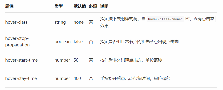
001 - 组件的属性

002 - 代码案例
1
2
3
4
5
<view class="box2" hover-class="box2_active">
<view class='box1' hover-class='active' hover-stop-propagation :hover-start-time="2000" :hover-stay-time='2000'>

</view>
</view>
button按钮组件的用法
001 - 组件的属性
属性名 类型 默认值 说明
size String default 按钮的大小
type String default 按钮的样式类型
plain Boolean false 按钮是否镂空,背景色透明
disabled Boolean false 是否按钮
loading Boolean false 名称是否带 loading t图标
  • button 组件默认独占一行,设置 sizemini 时可以在一行显示多个
002 - 案例代码
1
2
3
4
5
<button size='mini' type='primary'>前端</button>

<button size='mini' type='default' disabled='true'>前端</button>

<button size='mini' type='warn' loading='true'>前端</button>
image组件的使用
image

图片。

属性名 类型 默认值 说明 平台差异说明
src String 图片资源地址
mode String ‘scaleToFill’ 图片裁剪、缩放的模式

Tips

  • <image> 组件默认宽度 300px、高度 225px;
  • src 仅支持相对路径、绝对路径,支持 base64 码;
  • 页面结构复杂,css样式太多的情况,使用 image 可能导致样式生效较慢,出现 “闪一下” 的情况,此时设置 image{will-change: transform} ,可优化此问题。

uni-app中的样式

  • rpx 即响应式px,一种根据屏幕宽度自适应的动态单位。以750宽的屏幕为基准,750rpx恰好为屏幕宽度。屏幕变宽,rpx 实际显示效果会等比放大。

  • 使用@import语句可以导入外联样式表,@import后跟需要导入的外联样式表的相对路径,用;表示语句结束

  • 支持基本常用的选择器class、id、element等

  • uni-app 中不能使用 * 选择器。

  • page 相当于 body 节点

  • 定义在 App.vue 中的样式为全局样式,作用于每一个页面。在 pages 目录下 的 vue 文件中定义的样式为局部样式,只作用在对应的页面,并会覆盖 App.vue 中相同的选择器。

  • uni-app 支持使用字体图标,使用方式与普通 web 项目相同,需要注意以下几点:

    • 字体文件小于 40kb,uni-app 会自动将其转化为 base64 格式;

    • 字体文件大于等于 40kb, 需开发者自己转换,否则使用将不生效;

    • 字体文件的引用路径推荐使用以 ~@ 开头的绝对路径。

      1
      2
      3
      4
      @font-face {
      font-family: test1-icon;
      src: url('~@/static/iconfont.ttf');
      }
  • 如何使用scss或者less

uni-app中的数据绑定

在页面中需要定义数据,和我们之前的vue一摸一样,直接在data中定义数据即可

1
2
3
4
5
6
7
export default {
data () {
return {
msg: 'hello-uni'
}
}
}
插值表达式的使用
  • 利用插值表达式渲染基本数据

    1
    <view>{{msg}}</view>
  • 在插值表达式中使用三元运算

    1
    <view>{{ flag ? '我是真的':'我是假的' }}</view>
  • 基本运算

    1
    <view>{{1+1}}</view>
v-bind动态绑定属性

在data中定义了一张图片,我们希望把这张图片渲染到页面上

1
2
3
4
5
6
7
export default {
data () {
return {
img: 'http://destiny001.gitee.io/image/monkey_02.jpg'
}
}
}

利用v-bind进行渲染

1
<image v-bind:src="img"></image>

还可以缩写成:

1
<image :src="img"></image>
v-for的使用

data中定以一个数组,最终将数组渲染到页面上

1
2
3
4
5
6
7
8
9
10
data () {
return {
arr: [
{ name: '刘能', age: 29 },
{ name: '赵四', age: 39 },
{ name: '宋小宝', age: 49 },
{ name: '小沈阳', age: 59 }
]
}
}

利用v-for进行循环

1
<view v-for="(item,i) in arr" :key="i">名字:{{item.name}}---年龄:{{item.age}}</view>

uni中的事件

事件绑定

在uni中事件绑定和vue中是一样的,通过v-on进行事件的绑定,也可以简写为@

1
<button @click="tapHandle">点我啊</button>

事件函数定义在methods中

1
2
3
4
5
methods: {
tapHandle () {
console.log('真的点我了')
}
}
事件传参
  • 默认如果没有传递参数,事件函数第一个形参为事件对象

    1
    2
    3
    4
    5
    6
    7
    8
    // template
    <button @click="tapHandle">点我啊</button>
    // script
    methods: {
    tapHandle (e) {
    console.log(e)
    }
    }
  • 如果给事件函数传递参数了,则对应的事件函数形参接收的则是传递过来的数据

    1
    2
    3
    4
    5
    6
    7
    8
    // template
    <button @click="tapHandle(1)">点我啊</button>
    // script
    methods: {
    tapHandle (num) {
    console.log(num)
    }
    }
  • 如果获取事件对象也想传递参数

    1
    2
    3
    4
    5
    6
    7
    8
    // template
    <button @click="tapHandle(1,$event)">点我啊</button>
    // script
    methods: {
    tapHandle (num,e) {
    console.log(num,e)
    }
    }

uni的生命周期

应用的生命周期

生命周期的概念:一个对象从创建、运行、销毁的整个过程被成为生命周期。

生命周期函数:在生命周期中每个阶段会伴随着每一个函数的触发,这些函数被称为生命周期函数

uni-app 支持如下应用生命周期函数:

函数名 说明
onLaunch uni-app 初始化完成时触发(全局只触发一次)
onShow uni-app 启动,或从后台进入前台显示
onHide uni-app 从前台进入后台
onError uni-app 报错时触发
页面的生命周期

uni-app 支持如下页面生命周期函数:

函数名 说明 平台差异说明 最低版本
onLoad 监听页面加载,其参数为上个页面传递的数据,参数类型为Object(用于页面传参),参考示例
onShow 监听页面显示。页面每次出现在屏幕上都触发,包括从下级页面点返回露出当前页面
onReady 监听页面初次渲染完成。
onHide 监听页面隐藏
onUnload 监听页面卸载

下拉刷新

开启下拉刷新

在uni-app中有两种方式开启下拉刷新

  • 需要在 pages.json 里,找到的当前页面的pages节点,并在 style 选项中开启 enablePullDownRefresh
  • 通过调用uni.startPullDownRefresh方法来开启下拉刷新
通过配置文件开启

创建list页面进行演示

1
2
3
4
5
6
7
8
9
10
11
12
13
14
15
16
17
18
19
20
21
<template>
<view>
杭州学科
<view v-for="(item,index) in arr" :key="index">
{{item}}
</view>
</view>
</template>

<script>
export default {
data () {
return {
arr: ['前端','java','ui','大数据']
}
}
}
</script>

<style>
</style>

通过pages.json文件中找到当前页面的pages节点,并在 style 选项中开启 enablePullDownRefresh

1
2
3
4
5
6
{
"path":"pages/list/list",
"style":{
"enablePullDownRefresh": true
}
}
通过API开启

api文档

1
uni.startPullDownRefresh()
监听下拉刷新

通过onPullDownRefresh可以监听到下拉刷新的动作

1
2
3
4
5
6
7
8
9
10
11
12
13
14
15
export default {
data () {
return {
arr: ['前端','java','ui','大数据']
}
},
methods: {
startPull () {
uni.startPullDownRefresh()
}
},
onPullDownRefresh () {
console.log('触发下拉刷新了')
}
}
关闭下拉刷新

uni.stopPullDownRefresh()

停止当前页面下拉刷新。

案例演示

1
2
3
4
5
6
7
8
9
10
11
12
13
14
15
16
17
18
19
20
21
22
23
24
25
26
27
28
29
30
31
<template>
<view>
<button type="primary" @click="startPull">开启下拉刷新</button>
杭州学科
<view v-for="(item,index) in arr" :key="index">
{{item}}
</view>
</view>
</template>
<script>
export default {
data () {
return {
arr: ['前端','java','ui','大数据']
}
},
methods: {
startPull () {
uni.startPullDownRefresh()
}
},

onPullDownRefresh () {
this.arr = []
setTimeout(()=> {
this.arr = ['前端','java','ui','大数据']
uni.stopPullDownRefresh()
}, 1000);
}
}
</script>

上拉加载

通过在pages.json文件中找到当前页面的pages节点下style中配置onReachBottomDistance可以设置距离底部开启加载的距离,默认为50px

通过onReachBottom监听到触底的行为

1
2
3
4
5
6
7
8
9
10
11
12
13
14
15
16
17
18
19
20
21
22
23
24
25
26
27
28
<template>
<view>
<button type="primary" @click="startPull">开启下拉刷新</button>
杭州学科
<view v-for="(item,index) in arr" :key="index">
{{item}}
</view>
</view>
</template>
<script>
export default {
data () {
return {
arr: ['前端','java','ui','大数据','前端','java','ui','大数据']
}
},
onReachBottom () {
console.log('触底了')
}
}
</script>

<style>
view{
height: 100px;
line-height: 100px;
}
</style>

网络请求

在uni中可以调用uni.request方法进行请求网络请求

需要注意的是:在小程序中网络相关的 API 在使用前需要配置域名白名单。

发送get请求

1
2
3
4
5
6
7
8
9
10
11
12
13
14
15
16
17
18
19
<template>
<view>
<button @click="sendGet">发送请求</button>
</view>
</template>
<script>
export default {
methods: {
sendGet () {
uni.request({
url: 'http://localhost:8082/api/getlunbo',
success(res) {
console.log(res)
}
})
}
}
}
</script>

发送post请求

数据缓存

uni.setStorage

官方文档

将数据存储在本地缓存中指定的 key 中,会覆盖掉原来该 key 对应的内容,这是一个异步接口。

代码演示

1
2
3
4
5
6
7
8
9
10
11
12
13
14
15
16
17
18
19
20
21
22
23
24
<template>
<view>
<button type="primary" @click="setStor">存储数据</button>
</view>
</template>

<script>
export default {
methods: {
setStor () {
uni.setStorage({
key: 'id',
data: 100,
success () {
console.log('存储成功')
}
})
}
}
}
</script>

<style>
</style>
uni.setStorageSync

将 data 存储在本地缓存中指定的 key 中,会覆盖掉原来该 key 对应的内容,这是一个同步接口。

代码演示

1
2
3
4
5
6
7
8
9
10
11
12
13
14
15
16
17
18
<template>
<view>
<button type="primary" @click="setStor">存储数据</button>
</view>
</template>

<script>
export default {
methods: {
setStor () {
uni.setStorageSync('id',100)
}
}
}
</script>

<style>
</style>
uni.getStorage

从本地缓存中异步获取指定 key 对应的内容。

代码演示

1
2
3
4
5
6
7
8
9
10
11
12
13
14
15
16
17
18
19
20
21
22
23
24
<template>
<view>
<button type="primary" @click="getStorage">获取数据</button>
</view>
</template>
<script>
export default {
data () {
return {
id: ''
}
},
methods: {
getStorage () {
uni.getStorage({
key: 'id',
success: res=>{
this.id = res.data
}
})
}
}
}
</script>
uni.getStorageSync

从本地缓存中同步获取指定 key 对应的内容。

代码演示

1
2
3
4
5
6
7
8
9
10
11
12
13
14
15
<template>
<view>
<button type="primary" @click="getStorage">获取数据</button>
</view>
</template>
<script>
export default {
methods: {
getStorage () {
const id = uni.getStorageSync('id')
console.log(id)
}
}
}
</script>
uni.removeStorage

从本地缓存中异步移除指定 key。

代码演示

1
2
3
4
5
6
7
8
9
10
11
12
13
14
15
16
17
18
19
<template>
<view>
<button type="primary" @click="removeStorage">删除数据</button>
</view>
</template>
<script>
export default {
methods: {
removeStorage () {
uni.removeStorage({
key: 'id',
success: function () {
console.log('删除成功')
}
})
}
}
}
</script>
uni.removeStorageSync

从本地缓存中同步移除指定 key。

代码演示

1
2
3
4
5
6
7
8
9
10
11
12
13
14
<template>
<view>
<button type="primary" @click="removeStorage">删除数据</button>
</view>
</template>
<script>
export default {
methods: {
removeStorage () {
uni.removeStorageSync('id')
}
}
}
</script>

上传图片、预览图片

上传图片

uni.chooseImage方法从本地相册选择图片或使用相机拍照。

案例代码

1
2
3
4
5
6
7
8
9
10
11
12
13
14
15
16
17
18
19
20
21
22
23
24
25
26
27
28
<template>
<view>
<button @click="chooseImg" type="primary">上传图片</button>
<view>
<image v-for="item in imgArr" :src="item" :key="index"></image>
</view>
</view>
</template>

<script>
export default {
data () {
return {
imgArr: []
}
},
methods: {
chooseImg () {
uni.chooseImage({
count: 9,
success: res=>{
this.imgArr = res.tempFilePaths
}
})
}
}
}
</script>
预览图片

结构

1
2
3
<view>
<image v-for="item in imgArr" :src="item" @click="previewImg(item)" :key="item"></image>
</view>

预览图片的方法

1
2
3
4
5
6
previewImg (current) {
uni.previewImage({
urls: this.imgArr,
current
})
}

条件注释实现跨段兼容

条件编译是用特殊的注释作为标记,在编译时根据这些特殊的注释,将注释里面的代码编译到不同平台。

写法:以 #ifdef 加平台标识 开头,以 #endif 结尾。

平台标识

平台 参考文档
APP-PLUS 5+App HTML5+ 规范
H5 H5
MP-WEIXIN 微信小程序 微信小程序
MP-ALIPAY 支付宝小程序 支付宝小程序
MP-BAIDU 百度小程序 百度小程序
MP-TOUTIAO 头条小程序 头条小程序
MP-QQ QQ小程序 (目前仅cli版支持)
MP 微信小程序/支付宝小程序/百度小程序/头条小程序/QQ小程序
组件的条件注释

代码演示

1
2
3
4
5
6
7
8
9
10
11
12
13
14
15
<!-- #ifdef H5 -->
<view>
h5页面会显示
</view>
<!-- #endif -->
<!-- #ifdef MP-WEIXIN -->
<view>
微信小程序会显示
</view>
<!-- #endif -->
<!-- #ifdef APP-PLUS -->
<view>
app会显示
</view>
<!-- #endif -->
api的条件注释

代码演示

1
2
3
4
5
6
7
8
onLoad () {
//#ifdef MP-WEIXIN
console.log('微信小程序')
//#endif
//#ifdef H5
console.log('h5页面')
//#endif
}

样式的条件注释

代码演示

1
2
3
4
5
6
7
8
9
10
11
12
13
14
/* #ifdef H5 */
view{
height: 100px;
line-height: 100px;
background: red;
}
/* #endif */
/* #ifdef MP-WEIXIN */
view{
height: 100px;
line-height: 100px;
background: green;
}
/* #endif */

uni中的导航跳转

利用navigator进行跳转

navigator详细文档:文档地址

跳转到普通页面

1
2
3
<navigator url="/pages/about/about" hover-class="navigator-hover">
<button type="default">跳转到关于页面</button>
</navigator>

跳转到tabbar页面

1
2
3
<navigator url="/pages/message/message" open-type="switchTab">
<button type="default">跳转到message页面</button>
</navigator>
利用编程式导航进行跳转

导航跳转文档

利用navigateTo进行导航跳转

保留当前页面,跳转到应用内的某个页面,使用uni.navigateBack可以返回到原页面。

1
<button type="primary" @click="goAbout">跳转到关于页面</button>

通过navigateTo方法进行跳转到普通页面

1
2
3
4
5
goAbout () {
uni.navigateTo({
url: '/pages/about/about',
})
}

通过switchTab跳转到tabbar页面

跳转到tabbar页面

1
<button type="primary" @click="goMessage">跳转到message页面</button>

通过switchTab方法进行跳转

1
2
3
4
5
goMessage () {
uni.switchTab({
url: '/pages/message/message'
})
}

redirectTo进行跳转

关闭当前页面,跳转到应用内的某个页面。

1
2
3
4
5
6
7
8
<!-- template -->
<button type="primary" @click="goMessage">跳转到message页面</button>
<!-- js -->
goMessage () {
uni.switchTab({
url: '/pages/message/message'
})
}

通过onUnload测试当前组件确实卸载

1
2
3
onUnload () {
console.log('组件卸载了')
}
导航跳转传递参数

在导航进行跳转到下一个页面的同时,可以给下一个页面传递相应的参数,接收参数的页面可以通过onLoad生命周期进行接收

传递参数的页面

1
2
3
4
5
goAbout () {
uni.navigateTo({
url: '/pages/about/about?id=80',
});
}

接收参数的页面

1
2
3
4
5
6
7
<script>
export default {
onLoad (options) {
console.log(options)
}
}
</script>

uni-app中组件的创建

在uni-app中,可以通过创建一个后缀名为vue的文件,即创建一个组件成功,其他组件可以将该组件通过impot的方式导入,在通过components进行注册即可

  • 创建login组件,在component中创建login目录,然后新建login.vue文件

    1
    2
    3
    4
    5
    6
    7
    8
    9
    10
    11
    <template>
    <view>
    这是一个自定义组件
    </view>
    </template>

    <script>
    </script>

    <style>
    </style>
  • 在其他组件中导入该组件并注册

    1
    import login from "@/components/test/test.vue"
  • 注册组件

    1
    components: {test}
  • 使用组件

    1
    <test></test>
组件的生命周期函数
beforeCreate 在实例初始化之后被调用。详见
created 在实例创建完成后被立即调用。详见
beforeMount 在挂载开始之前被调用。详见
mounted 挂载到实例上去之后调用。详见 注意:此处并不能确定子组件被全部挂载,如果需要子组件完全挂载之后在执行操作可以使用$nextTickVue官方文档
beforeUpdate 数据更新时调用,发生在虚拟 DOM 打补丁之前。详见 仅H5平台支持
updated 由于数据更改导致的虚拟 DOM 重新渲染和打补丁,在这之后会调用该钩子。详见 仅H5平台支持
beforeDestroy 实例销毁之前调用。在这一步,实例仍然完全可用。详见
destroyed Vue 实例销毁后调用。调用后,Vue 实例指示的所有东西都会解绑定,所有的事件监听器会被移除,所有的子实例也会被销毁。详见

组件的通讯

父组件给子组件传值

通过props来接受外界传递到组件内部的值

1
2
3
4
5
6
7
8
9
10
11
12
13
14
<template>
<view>
这是一个自定义组件 {{msg}}
</view>
</template>

<script>
export default {
props: ['msg']
}
</script>

<style>
</style>

其他组件在使用login组件的时候传递值

1
2
3
4
5
6
7
8
9
10
11
12
13
14
15
16
17
18
<template>
<view>
<test :msg="msg"></test>
</view>
</template>

<script>
import test from "@/components/test/test.vue"
export default {
data () {
return {
msg: 'hello'
}
},

components: {test}
}
</script>
子组件给父组件传值

通过$emit触发事件进行传递参数

1
2
3
4
5
6
7
8
9
10
11
12
13
14
15
16
17
18
19
20
21
22
23
24
25
26
27
<template>
<view>
这是一个自定义组件 {{msg}}
<button type="primary" @click="sendMsg">给父组件传值</button>
</view>
</template>

<script>
export default {
data () {
return {
status: '打篮球'
}
},
props: {
msg: {
type: String,
value: ''
}
},
methods: {
sendMsg () {
this.$emit('myEvent',this.status)
}
}
}
</script>

父组件定义自定义事件并接收参数

1
2
3
4
5
6
7
8
9
10
11
12
13
14
15
16
17
18
19
20
21
22
<template>
<view>
<test :msg="msg" @myEvent="getMsg"></test>
</view>
</template>
<script>
import test from "@/components/test/test.vue"
export default {
data () {
return {
msg: 'hello'
}
},
methods: {
getMsg (res) {
console.log(res)
}
},

components: {test}
}
</script>
兄弟组件通讯

uni-ui的使用

uni-ui文档

1、进入Grid宫格组件

2、使用HBuilderX导入该组件

3、导入该组件

1
2
import uniGrid from "@/components/uni-grid/uni-grid.vue"
import uniGridItem from "@/components/uni-grid-item/uni-grid-item.vue"

4、注册组件

1
components: {uniGrid,uniGridItem}

5、使用组件

1
2
3
4
5
6
7
8
9
10
11
<uni-grid :column="3">
<uni-grid-item>
<text class="text">文本</text>
</uni-grid-item>
<uni-grid-item>
<text class="text">文本</text>
</uni-grid-item>
<uni-grid-item>
<text class="text">文本</text>
</uni-grid-item>
</uni-grid>

黑马商城实战项目

项目搭建
  • 利用HBuilder X创建基本项目结构

  • 运行项目

  • 整理基本项目结构,并修改窗口外观

    1
    2
    3
    4
    5
    6
    "globalStyle": {
    "navigationBarTextStyle": "white",
    "navigationBarTitleText": "黑马商城",
    "navigationBarBackgroundColor": "#1989fa",
    "backgroundColor": "#F8F8F8"
    }
配置tabbar
  • 创建tabbar对应的四个页面和图标准备好

  • 将页面路径配置到pages.json中的pages数组中

    1
    2
    3
    4
    5
    6
    7
    8
    9
    10
    11
    12
    13
    14
    "pages": [ //pages数组中第一项表示应用启动页,参考:https://uniapp.dcloud.io/collocation/pages
    {
    "path": "pages/index/index"
    },
    {
    "path": "pages/member/member"
    },
    {
    "path": "pages/cart/cart"
    },
    {
    "path": "pages/search/search"
    }
    ]
  • 配置tabbar

    1
    2
    3
    4
    5
    6
    7
    8
    9
    10
    11
    12
    13
    14
    15
    16
    17
    18
    19
    20
    21
    22
    23
    24
    25
    26
    27
    28
    29
    30
    31
    {
    "tabBar": {
    "list": [
    {
    "pagePath":"pages/index/index",
    "text":"首页",
    "iconPath":"static/icon/home.png",
    "selectedIconPath":"static/icon/home-active.png"
    },
    {
    "pagePath":"pages/member/member",
    "text":"会员",
    "iconPath":"static/icon/member.png",
    "selectedIconPath":"static/icon/member-active.png"
    },
    {
    "pagePath":"pages/cart/cart",
    "text":"购物车",
    "iconPath":"static/icon/cart.png",
    "selectedIconPath":"static/icon/cart-active.png"
    },
    {
    "pagePath":"pages/search/search",
    "text":"搜索",
    "iconPath":"static/icon/search.png",
    "selectedIconPath":"static/icon/search-active.png"
    }
    ]

    }
    }
获取轮播图数据
  • 封装uni.request请求,并挂在到全局

    • 创建util》api.js

      1
      2
      3
      4
      5
      6
      7
      8
      9
      10
      11
      12
      13
      14
      15
      16
      17
      18
      19
      20
      21
      22
      23
      24
      25
      // 封装get请求
      const baseUrl = "http://localhost:8082"
      export const myRequest = (options)=>{
      return new Promise((resolve,reject)=>{
      uni.request({
      method: options.method,
      data: options.data,
      url: baseUrl+options.url,
      success(res) {
      if(res.data.status !== 0) {
      return uni.showToast({
      title: '获取数据失败'
      })
      }
      resolve(res)
      },
      fail(err) {
      uni.showToast({
      title: '获取数据失败'
      })
      reject(err)
      }
      })
      })
      }
    • 在main.js中导入并挂载到全局

      1
      2
      import { myRequest } from './util/api.js'
      Vue.prototype.$myRequest = myReques
  • 获取轮播图的数据

    • 定义获取轮播图的方法

      1
      2
      3
      4
      5
      6
      7
      8
      9
      methods: {
      async getSwipers () {
      const res = await this.$myRequest({
      method: 'GET',
      url: '/api/getlunbo'
      })
      this.swipers = res.data.message
      }
      }
    • 在onLoad中调用该方法

      1
      this.getSwipers()
实现轮播图的结构和数据渲染
  • 定义轮播图的基本结构

    1
    2
    3
    4
    5
    <swiper class="swiper" indicator-dots :autoplay="true" :interval="2000" circular>
    <swiper-item v-for="item in swipers" :key="item.id">
    <image :src="item.img"></image>
    </swiper-item>
    </swiper>
  • 样式,在工具中安装scss

    1
    2
    3
    4
    5
    6
    7
    8
    9
    10
    11
    <style lang="scss">
    .home{
    swiper{
    height: 380rpx;
    image{
    width: 750rpx;
    height: 380rpx;
    }
    }
    }
    </style>
实现菜单导航结构
引入字体图标初始化样式
1
2
3
4
5
6
7
8
9
10
11
12
13
14
15
16
17
18
19
20
21
22
23
24
25
26
27
28
29
30
31
32
33
34
<style>
@font-face {font-family: "iconfont";
src: url('~@/static/fonts/iconfont.eot?t=1576335469449'); /* IE9 */
src: url('~@/static/fonts/iconfont.eot?t=1576335469449#iefix') format('embedded-opentype'), /* IE6-IE8 */
url('data:application/x-font-woff2;charset=utf-8;base64,d09GMgABAAAAAAVMAAsAAAAAChwAAAT/AAEAAAAAAAAAAAAAAAAAAAAAAAAAAAAAHEIGVgCDKAqHQIYhATYCJAMUCwwABCAFhG0HUBurCFGUTk6f7EeBu6eIlFFajBY208XLlGHx/6/hiYfvx76d+2xFJLlUn75pp4tCoyQ8NgiJUJjuJfzNpSrpXIDoeDbs3GjyH7Lfv+zTy1mok+GyEhYAW8AKaPvz/6eeG1QvDUo6SQW8bE4KYTDSMRj1R/5x7/TP88Dmo7Jc/misYXOelwWYYEBjbGxrAQ7KEvQW8SwuJBO4nkCvRQ21q/PbB5hXQLdAvDU6gHmbRQnhhG598xlb1lEvsu70PvEBfFU/H/+hF1IkNYO+149nMRz+6v7/fwrv4JAqI6T5uXCbRMYWUIhnX8+tKT22ZUrvJ3PaCdCNryR+Sb2RfRPT+c9kbdF0s788siIRDWj6GXkWL/ySEsVkfsmyftoYKiIZsiQfJ+Y2ll7MgdgDiE/AMF+CumLWsCSpdFXpjsNkefoatW8WSY8xapRhreWm1a9vWvVEM6edaQdPapImTzTLLG4BwEBG/HJsK4bVEKkStJbxbUYy3othvO2ofJA7jBARcUZ4illDuEL29TB2C/3AGWj4WUfGYbG25LTICaEk1jWBR8KWC0bqQJ+EjJYmOnvisiHzqtifvZ08X7NYzBaJWAJBglDIRIi3Fd/C3cbZjqEKvkh9Qmx2SKCgMAhD15VHVkCQMCWOP72YnLB0euHUpROzJ/PEYiR6wxK8ShC+ZsryVibGlbIzorOjqRKnhwyOKTIlMRoPSLgMlYvInDIKdwsQ8K2YbO2PReRsyxzZvrK0dWxUYUrIE2sPj8+sHNw6tUVhj0AgslvelUfhDnNG4k0YwgedbyX/ovPRL8SnqwOt/atMII/RGGMacyXGJOaq+MtGYDFMOL1Hk8OSJdfqARNMZkPmnDVh5DP0bjDpx6XAB6RO0JkqM4F0fNSNZMKXB20QqI//n+swdzCvnv1/JszOzMEszPsskD8RZtrarNB14gGhubjWlduokVnWD9e9PyCQd1jtvPjStKTGs6VZFT/xjhhW0hpkG6PoC0wW8iGUrPK9prFY4AM+9GF8APhKfIvr5tct+IoAxU/eE3ILa4yrDxTgUfkrG0lPTtshU4pGtXT9UJqywWkDhzyi/5ka15D+WlPn1Gd+QYF7s0j3dXTuS0oStZLum6on86NOwIbPcydIP3+STiDFaYk1Z6WFLPt7b7M6EhMA+Gr+qtDilfia4mPFr0p8JZUS973QHulzYJxsPjJ6xdeW7Wd75WHHrZsGDXaUb1hacCuQVmrOkt1DjdgTxSeY3EcWDqCzRLxB9PmH2DNplYhzhCDbNLfzY7dKy1jb/dqNFfBTXbWg8vhWsH1JP9IN0VQmIcif4isHay1vtVDzNIiyxeirbpZ0JKEXg3QAAqN+8jFMLN9E6DZhQtJlAbJuS2ght6DqcwRNt1Potelicp8xbEqUHmz4IBCGfUIy6DtkwyZoIb+hmvQLzXAQoddNbM3ZZyWKFk+YAqEYwxGayJZKsMuiVnxH2ucBW+Uq94m4MkHstjrO5AWVxHkMqPq6J6JQsS3wnGxGeW7RsU0pklYi4rbbbeV3plZkC1h0iZGAIDEUGkFGxCopubpYdL3/DtG8XIBDSn4knxBWMbWjrpZODPRCU8YqWZfGlT6tRwjFOynMKqBz6iI5xizk/FulSES0JCkizrY2q6Tialrl64ppLD0VysKcNVLkKFGjae8S40w5K14OB+WS9lKjkR/YgsrZsRnZzAAA') format('woff2'),
url('~@/static/fonts/iconfont.woff?t=1576335469449') format('woff'),
url('~@/static/fonts/iconfont.ttf?t=1576335469449') format('truetype'), /* chrome, firefox, opera, Safari, Android, iOS 4.2+ */
url('~@/static/fonts/iconfont.svg?t=1576335469449#iconfont') format('svg'); /* iOS 4.1- */
}

.iconfont {
font-family: "iconfont" !important;
font-size: 16px;
font-style: normal;
-webkit-font-smoothing: antialiased;
-moz-osx-font-smoothing: grayscale;
}

.icon-shipin:before {
content: "\f0024";
}

.icon-tupian:before {
content: "\e650";
}

.icon-guanyuwomen:before {
content: "\e608";
}

.icon-ziyuan:before {
content: "\e60d";
}
</style>
完成菜单导航基本结构
1
2
3
4
5
6
7
8
9
10
11
12
13
14
15
16
17
18
<view class="nav">
<view class="item">
<view class="iconfont icon-ziyuan"></view>
<text>黑马超市</text>
</view>
<view class="item">
<view class="iconfont icon-tupian"></view>
<text>联系我们</text>
</view>
<view class="item">
<view class="iconfont icon-guanyuwomen"></view>
<text>社区图片</text>
</view>
<view class="item">
<view class="iconfont icon-shipin"></view>
<text>视频专区</text>
</view>
</view>
菜单导航样式
1
2
3
4
5
6
7
8
9
10
11
12
13
14
15
16
17
18
19
20
21
22
23
24
25
26
27
.nav{
display: flex;
align-items: center;
.item{
width: 25%;
text-align: center;
view{
background: $shop-color;
line-height: 120rpx;
width: 120rpx;
height: 120rpx;
border-radius: 90px;
margin:10px auto;
}
text{
font-size: 15px;
}
}
.iconfont{
font-size: 25px;
color: #fff;
height: 50px;
}
.icon-tupian{
font-size: 20px;
}
}
实现推荐商品列表
定义基本结构
1
2
3
4
5
6
7
8
9
10
11
12
13
14
<view class="hot_goods">
<view class="tit">推荐商品</view>
<!-- 一般用法 -->
<view class="goods_list">
<view class="goods_item">
<image></image>
<view class="price">
<text>1299</text>
<text>12990</text>
</view>
<view class="name">华为(HUAWEI)荣耀6Plus 16G双4G版</view>
</view>
</view>
</view>
美化样式
1
2
3
4
5
6
7
8
9
10
11
12
13
14
15
16
17
18
19
20
21
22
23
24
25
26
27
28
29
30
31
32
33
34
35
36
37
38
39
40
41
42
43
44
45
46
47
48
49
50
.hot_goods {
background: #eee;
.tit{
border-top: 2px solid #eee;
border-bottom: 2px solid #eee;
margin-top: 20px;
margin-bottom: 3px;
color: $shop-color;
height: 50px;
line-height: 50px;
text-align: center;
letter-spacing: 20px;
background: #fff;
}
.goods_list {
display: flex;
padding: 0 15rpx;
justify-content: space-between;
overflow: hidden;
flex-wrap: wrap;
.goods_item {
width: 355rpx;
margin-bottom: 15rpx;
background: #fff;
padding: 10px;
box-sizing: border-box;
image{
height: 150px;
width: auto;
mix-width:160px;
margin: 10px auto;
}
.price{
font-size: 18px;
color: red;
padding: 8px 0;
text:nth-child(2){
color: #ccc;
text-decoration: line-through;
margin-left: 10px;
font-size: 13px;
}
}
.name {
font-size: 14px;

}
}
}
}
获取数据
  • 定义获取数据的方法

    1
    2
    3
    4
    5
    6
    7
    // 获取推荐商品
    async getGoods () {
    const res = await this.$myRequest({
    url: '/api/getgoods?pageindex=1'
    })
    this.goods = res.data.message
    }
  • 在onLoad生命周期中调用该方法

    1
    this.getGoods()
渲染数据
  • 通过v-for渲染数据

    1
    2
    3
    4
    5
    6
    7
    8
    9
    10
    11
    12
    13
    14
    <view class="hot_goods">
    <view class="tit">推荐商品</view>
    <!-- 一般用法 -->
    <view class="goods_list">
    <view class="goods_item" v-for="item in goods" :key="item.id">
    <image :src="item.img_url"></image>
    <view class="price">
    <text>{{item.sell_price}}</text>
    <text>{{item.market_price}}</text>
    </view>
    <view class="name">{{item.title}}</view>
    </view>
    </view>
    </view>
完成黑马超市页面
改造导航菜单
  • 定义数据

    1
    2
    3
    4
    5
    6
    7
    8
    9
    10
    11
    12
    13
    14
    15
    16
    17
    18
    19
    20
    21
    22
    navs: [
    {
    icons: "iconfont icon-ziyuan",
    title: "黑马超市",
    path: "/pages/goods/list"
    },
    {
    icons: "iconfont icon-tupian",
    title: "社区图片",
    path: "/pages/pics/pics"
    },
    {
    icons: "iconfont icon-guanyuwomen",
    title: "联系我们",
    path: "/pages/contact/contact"
    },
    {
    icons: "iconfont icon-shipin",
    title: "学习视频",
    path: "/pages/videos/videos"
    }
    ]
  • 渲染数据

    1
    2
    3
    4
    5
    6
    <view class="nav">
    <view class="item" v-for="(item,index) in navs" :key="index">
    <view :class="item.icons"></view>
    <text>{{item.title}}</text>
    </view>
    </view>
  • 给导航菜单注册点击事件

    1
    <view class="goods_item" v-for="item in goods" :key="item.id">
  • 定义跳转的方法

    1
    2
    3
    4
    5
    goNavigator (url) {
    uni.navigateTo({
    url
    })
    }
创建黑马超市页面
  • 创建页面,goods>list.vue
  • 将页面路劲配置到pages文件中,修改标题
封装商品列表组件
  • 在components下面创建goods>list.vue

    1
    2
    3
    4
    5
    6
    7
    8
    9
    10
    11
    12
    13
    14
    15
    16
    17
    18
    19
    20
    21
    22
    23
    24
    25
    26
    27
    28
    29
    30
    31
    32
    33
    34
    35
    36
    37
    38
    39
    40
    41
    42
    43
    44
    45
    46
    47
    48
    49
    50
    51
    52
    53
    54
    55
    56
    57
    58
    <template>
    <view class="goods_list">
    <view class="goods_item" v-for="item in goods" :key="item.id">
    <image :src="item.img_url"></image>
    <view class="price">
    <text>{{item.sell_price}}</text>
    <text>{{item.market_price}}</text>
    </view>
    <view class="name">{{item.title}}</view>
    </view>
    </view>
    </template>

    <script>
    export default {
    props:{
    goods:Array
    }
    }
    </script>

    <style lang="scss">
    .goods_list {
    display: flex;
    padding: 0 15rpx;
    justify-content: space-between;
    overflow: hidden;
    flex-wrap: wrap;
    .goods_item {
    width: 355rpx;
    margin-bottom: 15rpx;
    background: #fff;
    padding: 10px;
    box-sizing: border-box;
    image{
    height: 150px;
    width: 150px;
    display: block;
    margin: 10px auto;
    }
    .price{
    font-size: 18px;
    color: red;
    padding: 8px 0;
    text:nth-child(2){
    color: #ccc;
    text-decoration: line-through;
    margin-left: 10px;
    font-size: 13px;
    }
    }
    .name {
    font-size: 14px;

    }
    }
    }
    </style>
  • 在首页引入该组件

    1
    2
    3
    4
    5
    import goodsList from "../../components/goods-list/index.vue"

    components: {
    "goods-list":goodsList
    }
  • 使用组件并将数据传递到组件内部

    1
    <goods-list :goods="goods"></goods-list>
渲染商品列表
  • 定义获取商品列表数据的方法并调用

    1
    2
    3
    4
    5
    6
    7
    8
    9
    10
    11
    12
    13
    14
    15
    16
    17
    18
    19
    20
    21
    <script>
    export default {
    data () {
    return {
    goods: []
    }
    },
    methods: {
    async getGoods () {
    const res = await this.$myRequest({
    url: '/api/getgoods?pageindex=1'
    })
    this.goods = res.data.message
    },
    },

    onLoad () {
    this.getGoods()
    }
    }
    </script>
  • 引入商品组件并使用

    1
    2
    3
    4
    5
    6
    7
    8
    9
    10
    11
    12
    13
    14
    <template>
    <view class="goods_list">
    <goods-list :goods="goods"></goods-list>
    </view>
    </template>
    <script>
    import goodsList from "../../components/goods-list/index.vue"
    export default {
    components: {
    "goods-list": goodsList
    }
    }
    </script>

实现上拉加载更多
  • 通过onReachBottom来监听触底

    1
    2
    3
    4
    onReachBottom () {
    this.pageindex++
    this.getGoods()
    }
  • 修改给goods赋值

    1
    this.goods = [...this.goods,...res.data.message]
  • 动态显示底线

    • 通过onReachBottom监听是否还有更多

      1
      if(this.pageindex*10>this.goods.length) return this.flag = true
    • 通过v-if控制底线

      1
      <view class="over_line" v-if="flag">----------我是有底线的----------</view>
实现下拉刷新
  • 通过onPullDownRefresh进行下拉刷新的操作

    1
    2
    3
    4
    5
    6
    7
    8
    9
    10
    onPullDownRefresh() {
    this.goods = []
    this.pageindex = 1
    this.flag = false
    setTimeout(()=>{
    this.getGoods(()=>{
    uni.stopPullDownRefresh()
    })
    },1000)
    }
关于我们
实现社区图片
实现资讯列表
实现列表项的结构和样式

结构

1
2
3
4
5
6
7
8
9
10
<view class="news_item">
<image src="../../static/logo.png"></image>
<view class="content">
<view class="tit">1季度多家房企利润跌幅超50% 去库存促销战打响</view>
<view class="info">
<text>发表时间:2019-12-23</text>
<text>浏览:1次</text>
</view>
</view>
</view>

样式

1
2
3
4
5
6
7
8
9
10
11
12
13
14
15
16
17
18
19
20
21
22
23
24
25
26
27
.news{
.news_item{
display: flex;
padding: 5px 10px;
border-bottom: 3px solid $shop-color;
image{
width: 300rpx;
height: 150rpx;
}
.content {
padding: 5px 10px;
position: relative;
.tit{
font-size: 30rpx;
}
.info{
font-size: 26rpx;
position: absolute;
left: 10px;
bottom: 5px;
text:nth-child(2){
margin-left: 20px;
}
}
}
}
}
封装为组件

创建news-item.vue

1
2
3
4
5
6
7
8
9
10
11
12
13
14
15
16
17
18
19
20
21
22
23
24
25
26
27
28
29
30
31
32
33
34
35
36
37
38
39
40
41
42
43
44
45
46
47
48
49
50
51
52
53
54
55
56
57
<template>
<view>
<view class="news_item" v-for="item in data" :key="item.id">
<image :src="item.img_url"></image>
<view class="content">
<view class="tit">{{item.title}}</view>
<view class="info">
<text>发表时间:{{item.add_time | formatDate}}</text>
<text>浏览:{{item.click+123}}次</text>
</view>
</view>
</view>
</view>
</template>

<script>
export default {
props: ['data'],
filters:{
formatDate(data){
const date = new Date(data)
console.log(date)
const day = date.getMonth().toString().padStart(2,'0')+'-'+date.getDay().toString().padStart(2,'0')
return date.getFullYear()+'-'+day
}
}
}
</script>

<style lang="scss">
.news_item{
display: flex;
padding: 5px 10px;
border-bottom: 1rpx solid $shop-color;
image{
max-width: 200rpx;
min-width: 200rpx;
height: 150rpx;
}
.content {
padding: 5px 10px;
position: relative;
.tit{
font-size: 30rpx;
}
.info{
font-size: 26rpx;
position: absolute;
left: 10px;
bottom: 5px;
text:nth-child(2){
margin-left: 20px;
}
}
}
}
</style>
在新闻页面导入并使用
1
2
3
4
5
6
7
8
9
10
11
12
13
14
15
16
17
18
19
20
21
22
23
24
25
26
27
28
29
30
31
32
<template>
<view class="news">
<new-item :data="newsList"></new-item>
</view>
</template>
<script>
import newItem from '../../components/new-item/new-item.vue'
export default {
data() {
return {
newsList: []
}
},
methods: {
async getNewsList () {
const res = await this.$myRequest({
url:'/api/getnewslist'
})
this.newsList = res.data.message
}
},
onLoad () {
this.getNewsList()
},
components: {
"new-item":newItem
}
}
</script>

<style lang="scss">
</style>
点击列表进入详情
  • 点击子组件列表项通过this.$emit触发父组件的方法

    1
    2
    3
    navigatorTo (item) {
    this.$emit('clickItem',item)
    }
  • 父组件通过注册clickItem事件及事件函数实现跳转操作

    1
    2
    3
    4
    5
    6
    7
    8
    9
    10
    11
    12
    13
    14
    15
    16
    17
    <template>
    <view class="news">
    <new-item :data="newsList" @clickItem="goDetail"></new-item>
    </view>
    </template>
    <script>
    export default {
    methods: {
    goDetail (data) {
    console.log(data)
    uni.navigateTo({
    url: '/pages/news-detail/news-detail'
    })
    }
    }
    }
    </script>
  • 新建/pages/news-detail/news-detail页面

实现资讯详情
实现基本结构
1
2
3
4
5
6
7
8
9
10
11
12
13
14
15
16
17
18
19
20
21
22
23
24
25
26
27
28
29
30
31
32
33
34
35
36
37
38
39
40
41
42
<template>
<view class="news_detail">
<view class="news_title">
标题
</view>
<view class="info">
<text>发表时间:</text>
<text>浏览:</text>
</view>
<view class="content">

</view>
</view>
</template>

<script>
export default {
data() {
return {

}
},
methods: {

}
}
</script>

<style lang="scss">
.news_detail {
padding: 15rpx;
.news_title{
text-align: center;
font-size: 32rpx;
}
.info{
font-size: 28rpx;
display: flex;
justify-content: space-between;
}
}
</style>
获取详情的数据
1
2
3
4
5
6
7
8
9
10
11
12
13
methods: {
async getNewsDetail(id){
const res = await this.$myRequest({
url: '/api/getnew/'+id
})
console.log(res)
this.newsDetail = res.data.message[0]
}
},

onLoad (options){
this.getNewsDetail(options.id)
}
实现详情的渲染
1
2
3
4
5
6
7
8
9
10
<view class="news_title">
{{newsDetail.title}}
</view>
<view class="info">
<text>发表时间:{{newsDetail.add_time | formatDate}}</text>
<text>浏览:{{newsDetail.click}}</text>
</view>
<view class="content">
<rich-text :nodes="newsDetail.content"></rich-text>
</view>
实现商品详情页
商品列表注册点击事件
1
2
3
4
5
6
7
8
9
10
11
12
13
14
15
16
17
18
<template>
<view class="goods_list">
<view @click="itemClick(item)" class="goods_item" v-for="item in goods" :key="item.id">
</view>
</view>
</template>
<script>
export default {
props:{
goods:Array
},
methods: {
itemClick(item) {
this.$emit('itemClick',item)
}
}
}
</script>
父组件绑定自定义事件进行跳转
1
2
3
4
5
6
<goods-list @itemClick="godetail" :goods="goods"></goods-list>
godetail (item) {
uni.navigateTo({
url: '/pages/goods-detail/goods-detail?id='+item.id
})
}
创建商品详情页
获取详情轮播图数据
1
2
3
4
5
6
7
8
9
10
11
12
methods: {
async getDetail(){
const res = await this.$myRequest({
url:'/api/getthumimages/'+this.id
})
console.log(res)
}
},
onLoad(options){
this.id = options.id
this.getDetail()
}
渲染轮播图
1
2
3
4
5
6
7
8
9
10
11
12
13
14
15
16
<swiper indicator-dots>
<swiper-item v-for="item in swipers" :key="item.src">
<image :src="item.src"></image>
</swiper-item>
</swiper>
<style lang="scss">
.goods_detail{
swiper{
height: 700rpx;
image{
width: 100%;
height: 100%;
}
}
}
</style>
获取商品信息
1
2
3
4
5
6
7
8
9
10
11
12
methods: {
async getDetailInfo () {
const res = await this.$myRequest({
url:'/api/goods/getinfo/'+this.id
})
this.info = res.data.message[0]
}
},
onLoad(options){
this.id = options.id
this.getDetailInfo()
}
完成商品信息结构和渲染